Layering and tensions in dialogue
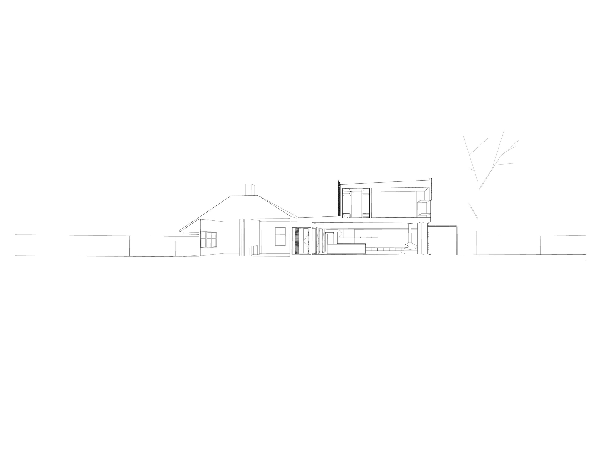
Renowned for the detail, Taut is an architectural practice based in Melbourne. Taut is influenced by the tensions in between. Of brutalist architecture of the late sixties and seventies, stability and strength in structure.
Clear designed the brand and bespoke typeface to be bold and deliberate across all applications. The tactility in paperstock and letterpress finishes were selected to represent the honesty of materials In Taut’s design philosophy. The mechanical use of system-based typography utilises the grid to create hierarchy and refinement.
The Taut studio doubles as a gallery space, operating year-round. Much like the collaborative culture of Taut as architects, TAUT Space invites artists and practitioners whose practices connect with Taut, hosting exhibitions exploring the robust, textural and the evolving skyline of Melbourne.
Client
Taut Architects
SECTOR
Architecture
Services
Art Direction, Brand Identity, Brand Strategy, Design Systems