Defining the shape of water
Nobody understands Australian waterways more than WSA (Water Stewardship Asia-Pacific), the leading authority on water management. Australia is the driest inhabited continent globally and is on the brink of a water crisis. WSA provides guidance, action plans and accreditation to communities on achieving sustainable water catchments.
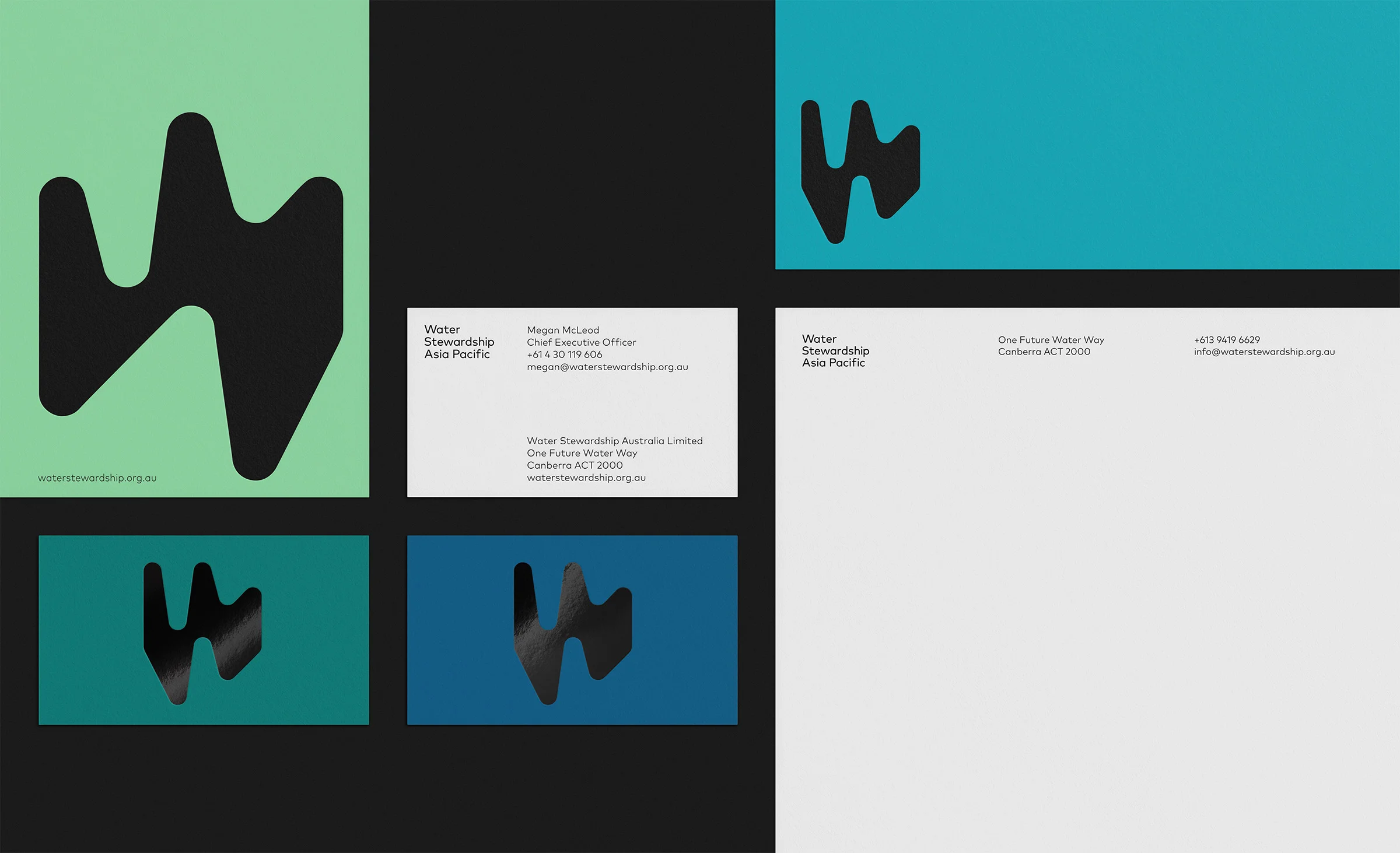
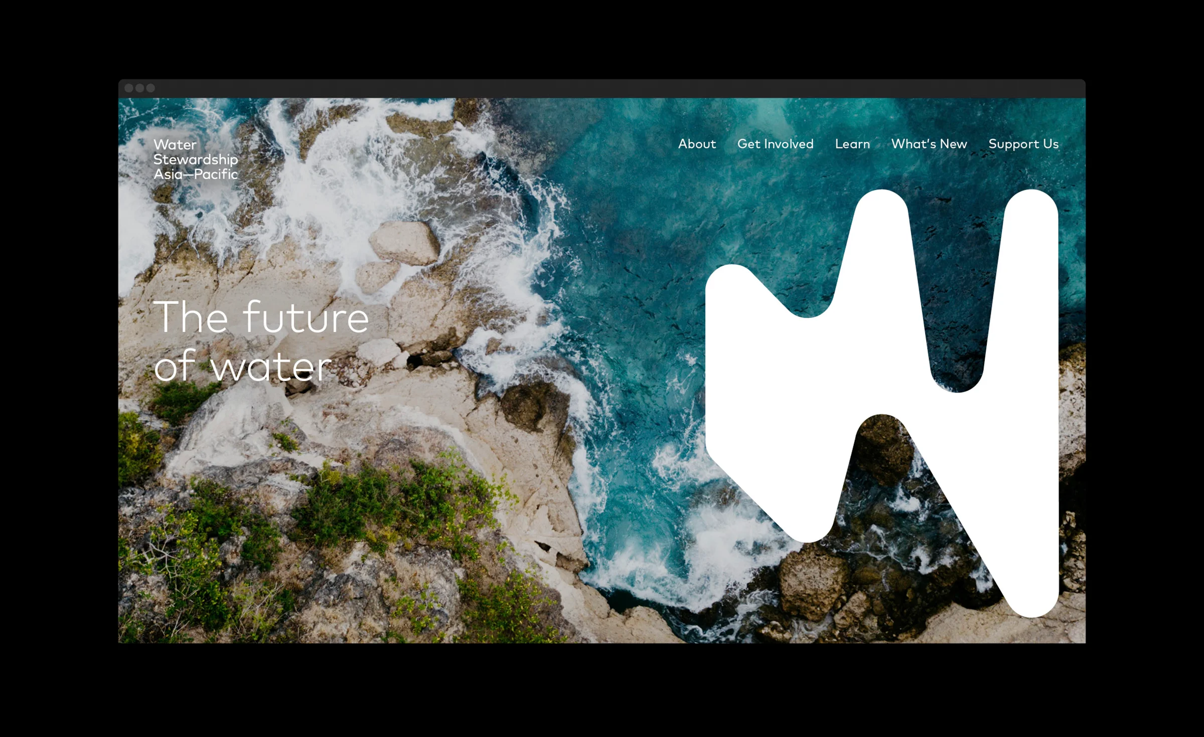
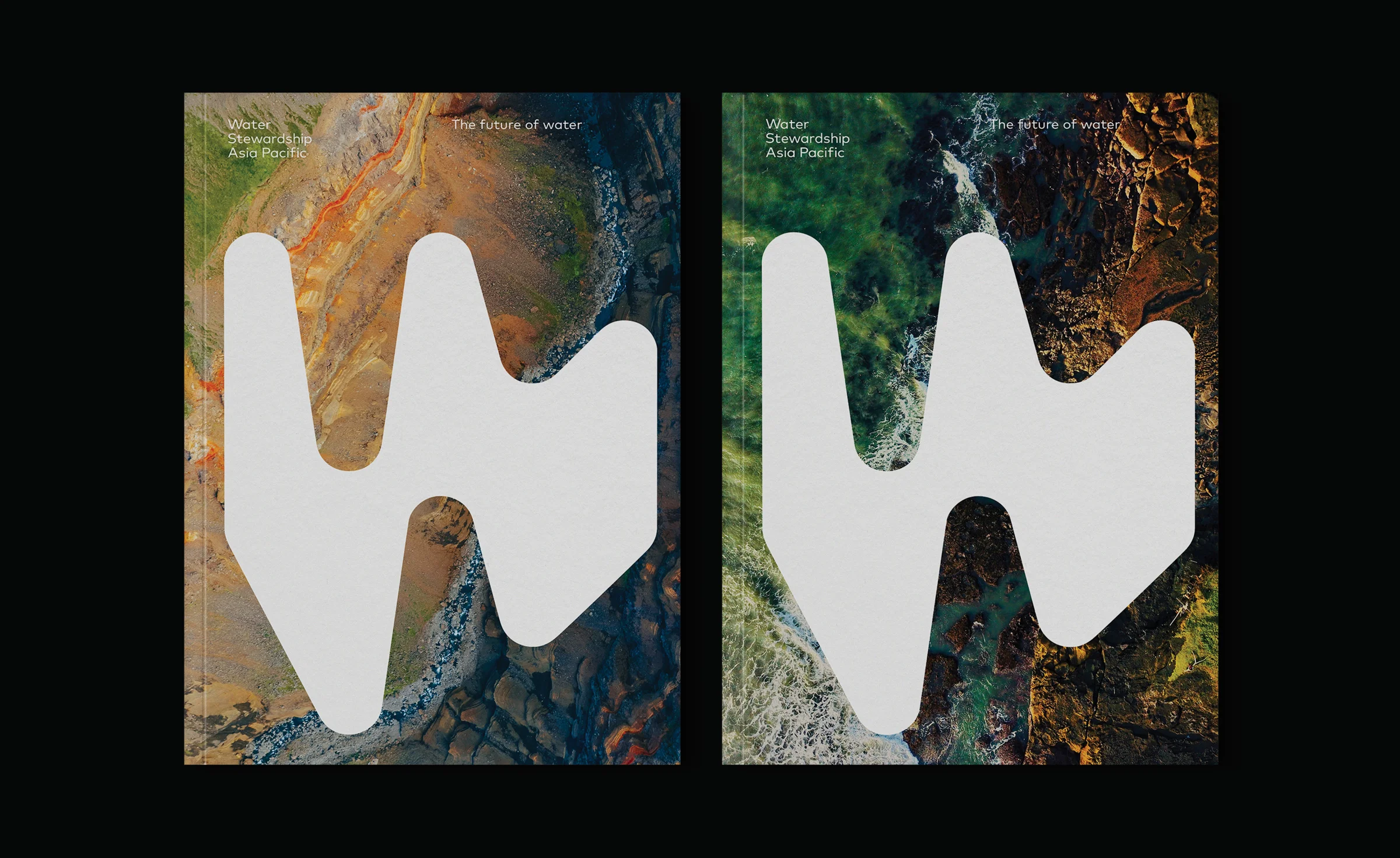
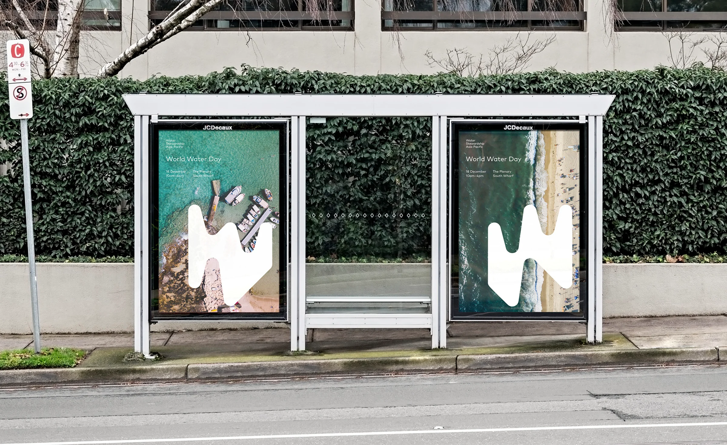
The WSA brand is based on the organic, fluid shape of water. The ‘W’ mark is the prominent brand element, which moves and morphs, changing forms. Flexible and dynamic, the design system was created to adapt to print and digital, where one single approach may not fit all.
Clear started our journey with WSA back in October 2021, with a detailed brand strategy process, which positioned the brand in its sector and sparked ideas for the new identity. The result is a bold, contemporary brand that feels inviting and progressive, emphasising the credibility of such an important organisation.
Client
Water Stewardship Asia Pacific
SECTOR
For Purpose
Services
Art Direction, Brand Identity, Brand Strategy, Design, Design Systems, Motion Design, Print


